CheckBox
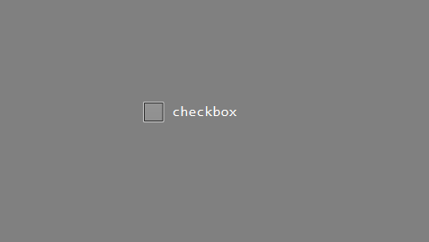
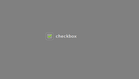
The check box is a control based on the button. If you need a switch button, or a check button, the check box control is more appropriate and easier to use. When the control is clicked, it will automatically switch to the selected state, and click again to switch to the non-selected state. While switching the state, it will automatically switch according to the picture and color set in the properties.
How to use
Double click to open the UI file
Find the
Checkboxcontrol in the control collection on the rightLeft-click the
Checkboxcontrol and hold it, then drag it to any position, release the left button, and you can see the automatically generated checkbox control.Left-click the check box control just generated, then you can see the related properties of the control on the right side of the editor.
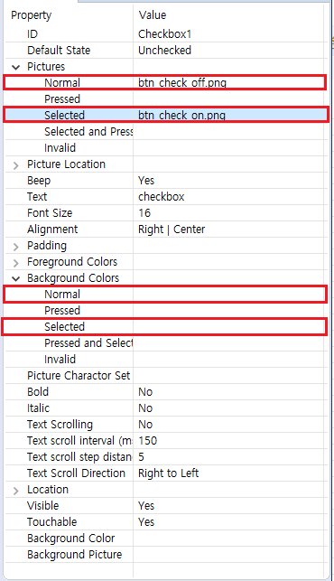
Set the pictures of each state and the color of each state as needed. Pay attention to the picture and color when selected.

If you set a picture and find that the size of the picture is displayed abnormally, you can adjust the position and size of the picture in the Picture Position property. Normally, we adjust the picture to the left of the rectangular area and the text to the right of the rectangular area.Compile after the properties are set, and its associated functions will be generated in the corresponding
Logic.cc. When you click on the control, the associated function will be called by the system, where the parameterbool isCheckedindicates the selected state.static void onCheckedChanged_Checkbox1(ZKCheckBox* pCheckBox, bool isChecked) { if (isChecked) { //Check box is selected LOGD("checked"); } else { //Checkbox is unselected LOGD("unchecked"); } }Download and debug, check the effect.
Sample code
Please refer to the CheckBoxDemo project in Sample Code.
Sample preview effect picture:

